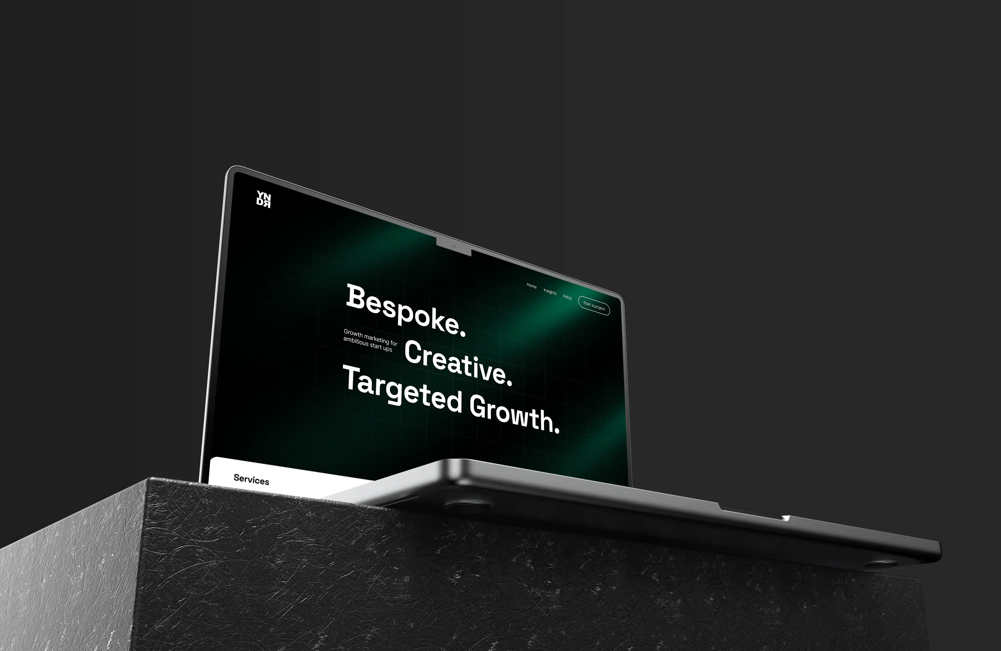
Yondr 2.0 - Framer Develpment
Elevating digital experiences with a sleek, user-centric website redesign tailored for the modern user.
About the Project
Yondr's website redesign project aimed to modernize its online presence, improving usability, aesthetics, and functionality. Focusing on user engagement, the new design enhances navigation, showcases services, and integrates responsive features for an all-around elevated digital experience.
Client
Will frelle
Industry
Design Stuido
Category
Web Developent
Duration
1 month
The initiative to revamp Yondr's website began with a strategic analysis of their existing online footprint, identifying areas for enhancement to better meet the needs of today's digital audience. Collaborating closely with Yondr stakeholders, we established a vision for a site that not only reflects Yondr's brand identity but also optimizes user experience through intuitive design and improved content structure.

The design phase was an iterative process, incorporating feedback from real users to ensure the final product would resonate with the target audience and drive engagement. Development focused on implementing responsive design principles, ensuring the site's optimal performance across all devices, and integrating SEO best practices to improve visibility.

Post-launch, our commitment to Yondr's success continued with ongoing analytics monitoring and adjustments to refine user experience and functionality, demonstrating our dedication to not just meeting but exceeding user expectations in the digital space.


